Friday 26 August 2016

Chat Box Problems plus Ways to Fix it

10 Comment(s) so far
Problem with chat box

Assalamualaikum and hi all! I am really sure that all blogger suffer the same problem as me on chat box ( Cbox ). Actually, there are some more problem that you will face if you put cbox widget on your site.So, let's go through all of it to make you think twice before adding cbox widget to your blog.

Some of the cbox problem


1. Cbox won't appear on a secure connection.

As Blogspot team turned on HTTPS Redirect, we can see this problem happened to cbox. Cbox will not appear if you view them on a website with HTTPS Redirect. This is not an issue if you are using your own custom domain because automatically it will disable HTTPS. Cbox will work on a secure connection if and only if you upgrade your cbox to premium.

2. Cbox is an Iframe widget

Having an Iframe widget on your site is a total disaster. Why did I said that? content in an Iframe cannot be indexed. It will lower your SEO ( Search Engine Optimization ) and slower your blog which will increase your page loading time.

3. Cbox is not private

If you think that you already private your cbox, think again. When you click on someone blog URL that they leave in your cbox, blogger will detect your cbox as a traffic source. So, an URL to your cbox is generated in someone else stats page and they can view and read your entire cbox messages.

I think for now, that is the only issue on cbox that I am aware of. I am sure that there are more to come.

How to fix cbox issue?

If you still want to add cbox widget on your blog please do this :


1. Disable HTTPS redirect

Follow below steps so that people will not view your blog on a secure connection.

Log into your blogger account > Go to Dashboard > Settings > Basic > HTTPS Redirect > Choose No > Save

2. Do not click URL directly from your cbox

If you want your cbox messages to stay secret, do not click any blog URL on your cbox, what you can do is copy link address and open it in a new tab. If you don't mind the fact that people can read your cbox message, you do not have an issue here.

3. Alter the cbox code

Okay, to avoid using Iframe type of widget, we can actually change the Iframe code to object code. How to do so? read below explanation

Example of cbox code :

<!-- BEGIN CBOX - www.cbox.ws - v001 -->
<div id="cboxdiv" style="text-align: center; line-height: 0">
<div><iframe frameborder="0" width="205" height="150" src="http://www7.cbox.ws/box/?boxid=467090&amp;boxtag=zg126z&amp;sec=main" marginheight="2" marginwidth="2" scrolling="auto" allowtransparency="yes" name="cboxmain7-ryfd" id="cboxmain7-rtg"></iframe></div>
<div><iframe frameborder="0" width="205" height="75" src="http://www7.cbox.ws/box/?boxid=12ef&amp;boxtag=zg126z&amp;sec=form" marginheight="2" marginwidth="2" scrolling="no" allowtransparency="yes" name="cboxform7-467090" style="border-top:2px solid #FFeeee;"> id="cboxform7-467ht"></iframe></div>
</div>
<!-- END CBOX -->

Explanation : Change the word iframe with object, Change the word src with data.

Example of the edited code :

<!-- BEGIN CBOX - www.cbox.ws - v001 -->
<div id="cboxdiv" style="text-align: center; line-height: 0">
<div><object frameborder="0" width="205" height="150" data="http://www7.cbox.ws/box/?boxid=467090&amp;boxtag=zg126z&amp;sec=main" marginheight="2" marginwidth="2" scrolling="auto" allowtransparency="yes" name="cboxmain7-ryfd" id="cboxmain7-rtg"></object></div>
<div><object frameborder="0" width="205" height="75" data="http://www7.cbox.ws/box/?boxid=12ef&amp;boxtag=zg126z&amp;sec=form" marginheight="2" marginwidth="2" scrolling="no" allowtransparency="yes" name="cboxform7-467090" style="border-top:2px solid #FFeeee;"> id="cboxform7-467ht"></object></div>
</div>
<!-- END CBOX -->

If you want to use cbox  without affecting your blog you can :


Show a link to your cbox.
People can view your cbox diectly in cbox site. So, you don't have to add the cbox widget to your blog. As I told you above, cbox widget is not friendly for your website. What you should do is get a direct URL of your cbox by following below steps :

Log into your cbox account > Click Publish on the top navigation bar > Locate your Quick Link which will show your cbox page.
As for me, my Quick Link is  http://my.cbox.ws/Teddy_chimi


If you also want to add the cbox link gadget as mine, follow this simple steps :

Log into your blogger account > Go to Dashboard > Layout > HTML/Javascript > Copy below code and paste it in the HTML/Javascript content.
If you wish to edit the code first, paste it here first then, copy and paste the edited code into the HTML/Javascript content.

<style>
.chat {
border-radius: 0px 15px 15px 0px;
width:30px; height:90px;
text-align:center;
padding:5px 5px 5px 0px;
position:fixed;
top:60px;left:0px;
background-color:#999999;
background-image:url(BACKGROUND IMAGE URL);
background-position:0px 0px;
-moz-transition: all 0.8s ease-in-out;
-o-transition: all 0.8s ease-in-out;
-ms-transition: all 0.8s ease-in-out;
transition: all 0.8s ease-in-out;
}
.chat a{
font:17px Century gothic;
font-weight:bold;color:#FFFFFF;
text-decoration:none;
text-shadow:1px 1px #777777;
}
.chat:hover {
width:50px;text-shadow:1px 1px #777777;
background-position:0px 100px;
}
</style>
<div class="chat">
<a href="QUICK LINK" target="_blank">C<br />B<br />O<br />X</a></div>

The Notes : Color code here
Blue text : Change with your background image URL
Red text : Change witth background color code
Fuchsia text : Font color
Lime text : Text shadow color
Orange text : Change with your Cbox Quick Link

Okay, I think that's all that I want to share with you guys about Cbox. I really hope that this post are useful and can increase your knowledge on cbox. If you have any problem regarding cbox that I am not aware of, you can share it by commenting on this post.

I will be very busy soon so, don't expect me to update my blog frequently. I do hope that I will have some time to update my blog. See you again next time.. Bye Bye  \ o /

Wednesday 24 August 2016

Free Edited Simple Template

5 Comment(s) so far
Simple template

Assalamualaikum and hi visitors ! Today, I would like to give a free edited version of simple template. As I blog walking to the other people blog, I noticed that many blogger use this kind of template which is simple with black and white theme. So, I decided to edit the simple template to suit your taste.

Skin Feature :

Free blogger template

Simple template preview


Grid view post
Custom share widget
Custom label widget
Custom Popular Posts widget
Custom Tabs widget
Mobile friendly template
SEO template

How to use this template?

1. Log in your blogger account.
2. Go to Dashboard > Template
3. Back up your template. ( Optional = In case you want to save your previous code )
4. Back up / Restore > Upload Template > Chose File > Upload


Load template

Upload template


How to edit this skin ?

  •  Firstly, Log into your blogger account > Dashboard > Layout
  • 1. Change blog title and blog description.
  • 2. Add blogger widget as in the image below..
Skin Layout

  • 3. For label widget, choose cloud display.
  • 4. For popular post widget, unpick snippet and image thumbnail.
  • 5. For social media widget, copy below code and paste it in the HTML/Javascipt widget content and change URL-HERE with your social profile URL.

<div id="fawesomeicons">
<a href="URL-HERE" title="Facebook" target="_blank" rel="nofollow"><i class="fa fa-facebook"></i></a>
<a href="URL-HERE" title="Google Plus" target="_blank" rel="nofollow"><i class="fa fa-google-plus"></i></a>
<a href="URL-HERE" title="Twitter" target="_blank" rel="nofollow"><i class="fa fa-twitter"></i></a>
<a href="URL-HERE" title="Pinterest" target="_blank" rel="nofollow"><i class="fa fa-pinterest"></i></a>
<a href="URL-HERE" title="Instagram" target="_blank" rel="nofollow"><i class="fa fa-instagram"></i></a>
<a href="URL-HERE" title="Bloglovin" target="_blank" rel="nofollow"><i class="fa fa-heart"></i></a>
<a href="URL-HERE" title="Tumblr" target="_blank" rel="nofollow"><i class="fa fa-tumblr"></i></a>
<a href="URL-HERE" title="RSS" target="_blank" rel="nofollow"><i class="fa fa-rss"></i></a>
<a href="URL-HERE" title="Youtube" target="_blank" rel="nofollow"><i class="fa fa-youtube"></i></a>
</div>

  • 6. Go to Template > Edit HTML > F3 / CTRL + F > Search  var perPage=4; and change 4 with the post number shown on your main page.
  • 7. For any error / problem / inquiries about this template. Kindly leave your comments on this post.
Do comment if you had downloaded this skin and wish to use this template.

Thursday 18 August 2016

Beautify Sidebar Widget

4 Comment(s) so far
Animal shape macarons

Assalamualaikum and hi people ;) So, today I would like to make a compilation of tutorial on how to beautify sidebar widget. Follower widget, Contact Form widget, Popular posts widget and Blog Archive widget.
  • 1. Log in your blogger account.
  • 2. Go to Dashboard > Template > Edit HTML.
  • 3. Back up your template. ( Optional = In case you want to save your previous code )
  • 4. Click ctrl + F and search for  ]]></b:skin>
  • 5. Copy below code and paste it above / before ]]></b:skin>

Where to find WidgetID ?

  • 1. Log in your blogger account.
  • 2. Go to Dashboard > Template > Edit HTML.
  • 3. Choose Jump to widget ( Now you can see a list of your widget ID. )
  • 4. Example : Widget ID for blog archive widget is BlogArchive1 for follower widget is Followers1

Widget Name

How to add background, border to certain widget ?


Border, background on follower widget

#WidgetID .widget-content {
padding:5px;  max-width:100%;
border:2px solid #FFD1D1;
background-color:#FFF4F4;
border-radius:10px;
}


Add scrollbox to widget :


Scroll box widget

#WidgetID .widget-content {
max-height: 200px;
padding:5px;  max-width:100%;
border:2px solid #FFD1D1;
background-color:#FFF4F4;
border-radius:10px;
overflow: auto;
}

Add icon beside blog archive post title :

Search the code like below using F3 or ctrl + F

<li><a expr:href='data:post.url'><data:post.title/></a></li>

Then add the code below between <li> and <a expr:href='data:post.url'><data:post.title/></a></li>

<img src='URL ICON' style='padding-right:5px;'/>
Example :
<li><img src='URL ICON' style='padding-right:5px;'/><a expr:href='data:post.url'><data:post.title/></a></li>

Change the color of blog archive arrow icon :

Search the code like below using F3 or ctrl + F
.widget .zippy {

Then, delete the code that you had search with it sub code.

Example of code to be deleted :
.widget .zippy {
  color: $(widget.alternate.text.color);
  text-shadow: 2px 2px 1px rgba(0, 0, 0, .1);
}

Then, replace the code with below code :
.widget .zippy {
color: #FACCCC;
text-shadow: 2px 2px 1px rgba(0, 0, 0, .1);}

Customize Popular Post Widget :


Customize popular post widget


#PopularPosts1 ul{
list-style:none;
counter-reset:li;
}
#PopularPosts1 li{
position:relative;
margin:0 0 10px 0;
padding: 3px 2px 0 17px;
left:-5px;
}
#PopularPosts1 ul li{
position: relative;
display: block;
padding: .4em .2em .4em 2em;
*padding: .2em;
margin: .5em 0;
text-decoration: none;
transition: all .3s ease-out;
}
#PopularPosts1 ul li:before{
content: counter(li);
counter-increment: li;
position: absolute;
height: 2em;
width: 2em;
line-height: 1.5em;
font-size: 25px;
color: #666666; /* text color of numbers */
text-align: center;
font-weight: bold;
border-radius: 2em;
position: absolute;
left: -12px;
transition: all .3s ease-out;
}

.popular-posts .item-thumbnail img {
width:55px; height:55px;
border-radius: 15px;
-moz-border-radius: 15px;
-ms-border-radius: 15px;
-o-border-radius: 15px;
-webkit-border-radius: 15px;
border: 1px solid #C5DEBA;
padding:3px;background:#F4E0CD;
-webkit-box-shadow:0 1px 1px #ccc;
-moz-box-shadow:0 1px 1px #ccc;
box-shadow:0 1px 1px #ccc;
-moz-transition: all 0.5s ease-in-out;
-o-transition: all 0.5s ease-in-out;
-ms-transition: all 0.5s ease-in-out;
transition: all 0.5s ease-in-out;
}

.popular-posts .item-thumbnail img:hover {
opacity:1.0;
transform:scale(1.2) rotate(5deg);
-moz-transform:scale(1.2) rotate(5deg);
-ms-transform:scale(1.2) rotate(5deg);
-o-transform:scale(1.2) rotate(5deg);
-webkit-transform:scale(1.2) rotate(5deg));
}


Customize contact form :

Customize

/* Contact Form Container */
.contact-form-widget {
width:220px;
font:13px century gothic;
max-width: 100%;
margin: 0 auto;
padding: 10px;
border:3px dotted #BDE5D7;
background-color:#FFFAE6;
color: #222222;
background-image:url(https://i.imgur.com/saPGOlL.png);
}

/* Fields and submit button */
.contact-form-name, .contact-form-email, .contact-form-email-message {
width: 100%;
max-width: 100%;
margin-bottom: 2px;
padding:5px;
font:12px century gothic;
}

/* Submit button style */
.contact-form-button-submit {
border: 3px solid #F4E0CD;
background:#BDE5D7;
color: #222222;
width: 100%;
max-width: 100%;
margin-top: 4px;
text-align:center;
font:13px century gothic;
}

/* Submit button on mouseover */
.contact-form-button-submit:hover{
background: #F4E0CD;
border: 3px solid #BDE5D7;
}
.contact-form-name {
background-image:url(https://i.imgur.com/tDtge.png)
}
.contact-form-email {
background-image:url(https://i.imgur.com/tDtge.png)
}
.contact-form-email-message {
background-image:url(https://i.imgur.com/tDtge.png)
}

The Notes : Color code here
Blue Text : Widget ID
Orange Text : Border color
Fuchsia Text : Background color and background image URL here
Green Text : Text color
Purple Text : URL icon here
Grey Text : Form background image URL


...........PREVIEW AND SAVE...........
Do comments for any inquiries
......................................

Monday 15 August 2016

Preparation for University

6 Comment(s) so far
My condition right now T.T

Assalamualaikum dan hai semua. Okay, let me talk about myself on this entry. Jadi, berkaitan dengan tajuk di atas, macam mana progress preparation saya? hmm I think it's only 10% toward ready. Saya rasa, kebanyakan pelajar yg akan melanjutkan pelajaran ke peringkat ijazah juga sedang busy preparing all the stuff untuk daftar, pack barang,print out doc, photostate doc + pengesahan, survey University, buat medical check-up, bukak buku bank, mohon pinjaman / biasiswa, shopping barang nak bawak. Antara banyak benda yg saya list kan tu, saya cuma dah siap print out doc je.. haha Photostat doc tu ada yg dah ada yg belom. Well, take it easy don't rush up but don't miss out. ( My life motto ).

Haritu saya ada buat post pasal result UPU saya. Inn Syaa Allah, saya memilih untuk melanjutkan pelajaran di UPM bagi kos Sains Pengajian Makanan. Semoga ini adalah pilihan yg terbaik bagi saya. Kebanyakan Universiti awam daftar pada 28 hb 8 ni. Tapi, untuk UPM 31 hb 8 baru daftar..Alhamdulillah dapat extra time at home.Bagi pelajar UPM Kampus Serdang, kami tak payah buat medical check-up di Hospital kerajaan / swasta sebab nanti kami akan buat medical check-up di Pusat Kesihatan Universiti.. Mudah kan? so, settle one task. Tapi, kalau yg UPM Kampus Bintulu kena buat kat Hospital rasanya sebab Kampus Serdang ada budak Medic maybe diorang praktikal buat medical check-up. ( Just my postulate ) haha.Kat Kampus Bintulu mana ada budak Medic.

UPM
Ini surat tawaran UPM.

Nampak tak dia punya yuran tu?? Mahal kan kalau tengok sekali lalu. Sebenarnya yuran tu dia dah campur sekali yuran pendaftaran, penginapan, pengangkutan, medical check-up, Meal-plan ( cuma di UPM rasanya ), kos pengajian sem dan banyak lagi sebenarnya. Dia compile semua bayaran supaya kita tak payah bayar banyak kali. Kalau korang nak Universiti yg menawarkan yuran yg murah, apply la UiTM.( I am not a promoter ) Tapi, UiTM kan khas untuk Bumiputera so, dia murah dalam 700 lebih je yuran tapi tak surela overall yuran ke ada kena bayar kos lain lagi. Pasal Mealplan tu UPM buat macam bayaran makan kita kot dalam 400 lebih. Jadi, kalau kita nak beli makanan guna dulu kad Mealplan tu sampai habis lpastu baru boleh guna duit kita kalau tak cukup. Pasal Mealplan ni saya tak pasti sangat memandangkan belum ada pengalaman guna.

UPM ni antara Universiti yg terbesar di Malaysia. Universiti mana yg paling besar saya tak pasti.. Risau jugaklah awal-awal masuk ni nanti nak cari kelas, dewan kuliah semua.huhu takpe boleh tanya senior nanti. Benda paling penting bila masuk U nanti, kenalah tahu fakulti awak tu apa dan tempatnya di mana. Fakulti saya namanya Fakulti Sains dan Teknologi Makanan (FSTM). Kolej kediaman pon wajib tahu. Kang tak pasal-pasal salah bilik. Kot ye pon first time kan masuk U.huhu

So, how was my feeling right now ? Excited jugaklah nak masuk U kan.. Siapa tak nak. Ramai orang yg dah tinggalkan zaman U ni rindu dan teringin nak rasai lagi pengalaman jadi budak U.(Betul tak?)
Sebabtu ada yg sambung belajar sampailah ke peringkat PhD maybe sebab nak habiskan masa sebagai seorang pelajar. I am also feeling scared on the same time. Takut susah nak adapt dengan study environment dia. Well, time kat matrik kan still macam time sekolah sebab Lecturer pon sangat ambil berat, ada kelas tutor, dan senang nak tanya lecturer kalau ada yg tak difahami. Zaman U ni kena banyak berdikari. Tapi, Inn Syaa Allah lama kelamaan akan terbiasa dengan situasi ni.

Tak boleh dinafikan, memang kena banyak keluar duit pon kalau nak further study nie. Alhamdulillah saya dapat Universiti dalam semenanjung Malaysia. Kalau yg dapat di Sabah, Sarawak atau overseas memang kena ready lah dengan kos tiket flight. Sekarang ni bukan senang nak dapat biasiswa. Biasiwa JPA sekarang dah tak tengok result matrik sebab dia akan tengok result sem 1 di Universiti nanti. Kalau cemerlang baru boleh mohon. Bukan senang nak dapat pon. Time matrik tu korang apply lah biasiswa Maybank, Petronas, MyBrainSC dan lain-lain. MyBrainSC untuk yg nak ambil kos Sains tulen je di Universiti seperti Pure chem, pure Bio, Pure Physic sebab MyBrainSC bukak peluang untuk mereka yg nak jadi lecturer di Matric. ( I think laa ).

Okay lah, setakat ini sahaja tinta saya pada hari ini. Tak larat dah ni.. Demam =,= Alhamdulillah kifarah dosa. Nak rehat.. See you soon \o/

Friday 12 August 2016

Put Tagged Post Widget

Be the first to comment!
Label widget 

Assalamualaikum and hai readers ^^, Today, I want to fulfill one tutorial request by a blogger on my facebook..This widget was coded by myself so, credit me with a back link if you wish to re-tutor. This tagged post can also be considered as updated version of label widget. This label post widget is floating at the top of your blog. Hanging Label widget. If you like to add the hanging label widget to your blog, follow below steps.

1. Firstly, Log into your blogger account.
2. Go to Dashboard > Layout > Add a Gadget > HTML/JavaScript
3. Copy any code below based on the style that you want and paste it on the content section of the HTML/Javascript widget.
4. If you wish to customize it first, paste it here first.Next, paste the edited code to the HTML/Javascript

<style>
a.bar {
font:12px century gothic;
text-transform:uppercase;
letter-spacing:4px;
text-align:center;
text-decoration:none;
color:#000000;
padding:2px;margin:2px;
width:140px; height:15px;
display:block;
background-color: #f7c3cc;
background-image:url(BACKGROUND WOOD);
background-size:100%;
box-shadow: 0px 3px 3px #f5adba;
background-position:100% 100%;
-moz-transition: all 0.5s ease-in-out;
-o-transition: all 0.5s ease-in-out;
-ms-transition: all 0.5s ease-in-out;
transition: all 0.5s ease-in-out;
}
a.bar:hover{
background-image:url(BACKGROUND WOOD);
background-size:10%;background-position:0% 0%;
}

.border {
width:65px;height:14px;
background:transparent;margin-top:-10px;margin-bottom:-5px;
border-right:5px solid #f8b6c2;border-left:5px solid #f8b6c2;
text-align:center;
}
.rope {
width:65px;height:12px;
background:transparent;margin-top:-3px;margin-bottom:-5px;
border-right:5px solid #f8b6c2;border-left:5px solid #f8b6c2;
text-align:center;
}
</style>
<center><div style="position:fixed;top:0px;left:5px;background-image:url(TAGGED POST IMAGE); width:168px; height:61px;padding-top:35px;"></div>
<center><div style="position:fixed;top:98px;left:15px;">
<div class="border"></div>
<a class="bar" href="http://YOUR LINK.blogspot.com/search/label/LABEL NAME?&max-results=6" title="TOOLTIP TITLE" >TITLE</a><div class="rope"></div>
<a class="bar" href="http://YOUR LINK.blogspot.com/search/label/LABEL NAME?&max-results=6" title="TOOLTIP TITLE" >TITLE</a>
</div></center></center>

The Notes :
Fuchsia text : Color code here
Blue text : Background image URL ( wood background )
Example :
"http://kawaiilady.blogspot.com/search/label/study?&max-results=6"title="STUDENT LIFE" >STUDY</a>

Extras : Freebies tagged post image

If you want to save the image :
Right click --> Save image as...
If you want to copy image URL :
Right click --> Copy image address / Copy image location

Size : 168 pixel x 96 pixel


I had added ads on this site, I hope you guys can help me by clicking on the ads.. Okay that's all from me. Do comment on this post.. :D

Sunday 7 August 2016

Freebies Doodle Wedding Dress, Suit

1 Comment so far
Muslimah doodle, Doodle wedding


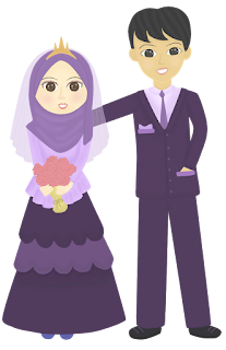
Assalamualaikum and holla peeps.. How was your day? I spent almost 3 days to complete drawing and colouring this doodle. Hope you like it.

Rules that need to be followed before downloading this doodles :

  1. Make sure you had already follow my blog, follow my blog first if you haven't.
  2. Use it only for personal use. ( For header image, wedding invitation, wedding card, printable for personal use )
  3. Don't use my doodle for commercial purpose. ( Don't sell my doodle )
  4. Don't re-draw my doodle and claim it as yours. ( I put a lot of effort to finish making this doodle )
  5. Don't re-freebies this doodle.
I am giving this doodle for free. So, do appreciate it. I would be glad to create more doodle freebies in the future if you follow my rule.


How to get the image URL?
For chrome : Click picture for bigger size > Right click >  Choose (copy image address)
For mozilla : Click picture for bigger size > Right click >  Choose (copy image location)

How to save the image?
Click picture for bigger size > Right click >  Save image as... > Choose file directory > Save

Cyan doodle   Purple doodle


Brown doodle   Green wedding suite


Grey doodle   Turquoise doodle


Green plus brown doodle   Fuchsia doodle


Blue gown doodle   Brownish red doodle

Moss color doodle   Violet doodle


Do take it if you want.. ^^, Do leave your comment..Okay, bye guys \o/

Wednesday 3 August 2016

4 Style Slide Out Status Box

15 Comment(s) so far

Customize status box


Assalamualaikum and hi readers... Today, I would like to make a tutorial on 4 style slide out status box. Click on demo here to see the example. All the design was created and coded by myself. Please do not copy this tutorial without a proper credit. All the style are optimized for Chrome, Firefox and IE browser.

1. Firstly, Log into your blogger account.
2. Go to Dashboard > Layout > Add a Gadget > HTML/JavaScript
3. Copy any code below based on the style that you want and paste it on the content section of the HTML/Javascript widget.
4. If you wish to customize it first, paste it here first.Next, paste the edited code to the HTML/Javascript

Status box
STYLE 1 : Simple.

<style>
.hover {
border-radius: 0px 15px 15px 0px;
width:10px; height:102px;
text-align:center;
padding:10px 15px;
font:17px Century gothic;
font-weight:bold;
margin-top:-8px;
margin-left:206px;
background-color: #F2B1A9
color:#FFFFFF
-moz-transition: all 0.8s ease-in-out;
-o-transition: all 0.8s ease-in-out;
-ms-transition: all 0.8s ease-in-out;
transition: all 0.8s ease-in-out;
}
#stat {
position:fixed;
border:2px solid #F2B1A9;
width:200px;
left:-220px;
top:70px;  /*the position of slide box minimum 0*/
height:106px;
padding:6px;
background-color:#FFD9CF;
color:#333333;
-moz-transition: all 0.8s ease-in-out;
-o-transition: all 0.8s ease-in-out;
-ms-transition: all 0.8s ease-in-out;
transition: all 0.8s ease-in-out;
}
#stat:hover {
left:0px;
}
.text {
padding:4px;
height:72px;
margin-top:-110px;
text-align:left;
overflow-y:scroll;
overflow-x:hidden;
border:2px inset #F9D2CC;
font:12px Century Gothic;
color:#444444;
background-color:#FEF0ED;
}
.date{
float:center;
margin-top:2px;
border-radius:5px;
font:11px Century Gothic;
text-align:center;
padding:2px;
background-color:#FFF8F7;
width:50%;
}
</style>
<center><div id="stat"><div class="hover">
H<br />o<br />v<br />e<br />r</div>
<center>
<div class="text">YOUR STATUS HERE</div>
<div class="date">DATE<div>
</div></div></div>
</center>

Status box
STYLE 2 : Flower.

<style>
.hover {
text-align:center;
margin-top:60px;
margin-left:210px;
-moz-transition: all 0.8s ease-in-out;
-o-transition: all 0.8s ease-in-out;
-ms-transition: all 0.8s ease-in-out;
transition: all 0.8s ease-in-out;
}
#stat {
position:fixed;
width:200px;
left:-200px;
top:70px; /*the position of slide box minimum 0*/
height:105px;
border-radius:0px 50px 50px 0px;
border-right:20px solid #baf3b5;
padding:6px;
background-color:#eddaa8;
color:#333333;
-moz-transition: all 0.8s ease-in-out;
-o-transition: all 0.8s ease-in-out;
-ms-transition: all 0.8s ease-in-out;
transition: all 0.8s ease-in-out;
}
#stat:hover {
left:0px;
}
.text {
padding:4px;
height:90px;
width:90%;
margin-top:-58px;
text-align:left;
border:2px solid #F9D2CC;
border-radius:0px 30px 30px 0px;
font:12px Century Gothic;
color:#444444;
background-color:#FEF0ED;
}
#flower1 {
font:35px tahoma;
color:#cfa9e3;
position:absolute;
margin-top:-64px; margin-left:3px;
}
#flower2 {
font:45px tahoma;
color:#E9967A;
position:absolute;
margin-top:-44px; margin-left:8px;
}
#flower3 {
font:35px tahoma;
color:#cfa9e3;
position:absolute;
margin-top:-8px; margin-left:3px;
}
#flower4 {
font:25px tahoma;
color:#a1cae7;
position:absolute;
margin-top:19px; margin-left:-8px;
}
#flower5 {
font:25px tahoma;
color:#a1cae7;
position:absolute;
margin-top:-75px; margin-left:-8px;
}
</style>
<center><div id="stat"><div class="hover">
<div id="flower1">✿</div><div id="flower2">✿</div><div id="flower3">✿</div>
<div id="flower4">✿</div><div id="flower5">✿</div>
</div>
<div class="text">YOUR STATUS HERE</div>
</div></div>
</div>
</center>

Status box
STYLE 3 : Bear.

<style>
.hover {
text-align:center;
margin-top:60px;
margin-left:210px;
-moz-transition: all 0.8s ease-in-out;
-o-transition: all 0.8s ease-in-out;
-ms-transition: all 0.8s ease-in-out;
transition: all 0.8s ease-in-out;
}
#stat {
position:fixed;
width:200px;
left:-215px;
top:70px; /*the position of slide box minimum 0*/
height:105px;
border-radius:0px 70px 70px 0px;
border-right:55px solid #F0DFAC;
padding:6px;
background-color:#F0DFAC;
color:#333333;
-moz-transition: all 0.8s ease-in-out;
-o-transition: all 0.8s ease-in-out;
-ms-transition: all 0.8s ease-in-out;
transition: all 0.8s ease-in-out;
}
#stat:hover {
left:0px;
}
.text {
padding:4px;
height:88px;width:90%;
margin-top:-98px;
text-align:left;
overflow-y:scroll;
overflow-x:hidden;
border:2px solid #FAE9BA;
font:12px Century Gothic;
color:#444444;
background-color:#FFECE4;
}
#ear1 {
background-color:#F0DFAC;
height:40px; width:35px;
margin-top:-67px;margin-left:25px;
border-radius:50px 100px 100px 50px;
-webkit-transform: rotate(-35deg); -moz-transform: rotate(-35deg); -o-transform: rotate(-35deg);transform: rotate(-35deg);
}
#ear2 {
background-color:#F0DFAC;
height:40px; width:35px;
margin-top:35px;margin-left:25px;
border-radius:50px 100px 100px 50px;
-webkit-transform: rotate(35deg); -moz-transform: rotate(35deg); -o-transform: rotate(35deg);transform: rotate(35deg);
}
#eye1 {
background-color:#777777;
height:10px; width:10px;
margin-top:-40px;margin-left:12px;
border-radius:100%;
}
#eye2 {
background-color:#777777;
height:10px; width:10px;
margin-top:-53px;margin-left:12px;
border-radius:100%;
}
#nose {
background-color:#C09E89;
height:15px; width:10px;
font:20px arial;
font-weight:bold;
border-radius:100%;
margin-top:10px; margin-left:2px;
}
#lobe1 {
background-color:#D6C0A3;
height:20px; width:15px;
margin-top:-58px;margin-left:38px;
border-radius:50px 100px 100px 50px;
-webkit-transform: rotate(-35deg); -moz-transform: rotate(-35deg); -o-transform: rotate(-35deg);transform: rotate(-35deg);
}
#lobe2 {
background-color:#D6C0A3;
height:20px; width:15px;
margin-top:56px;margin-left:38px;
border-radius:50px 100px 100px 50px;
-webkit-transform: rotate(35deg); -moz-transform: rotate(35deg); -o-transform: rotate(35deg);transform: rotate(35deg);
}
</style>
<center><div id="stat"><div class="hover">
<div id="ear1"></div><div id="ear2"></div><div id="eye1"></div><div id="eye2"></div>
<div id="nose"></div><div id="lobe1"></div><div id="lobe2"></div>
</div>
<div class="text">YOUR STATUS HERE</div>
</div>
</center>

Status box
STYLE 4 : Girl.

<style>
.hover {
text-align:center;
margin-top:60px;
margin-left:210px;
-moz-transition: all 0.8s ease-in-out;
-o-transition: all 0.8s ease-in-out;
-ms-transition: all 0.8s ease-in-out;
transition: all 0.8s ease-in-out;
}
#stat {
position:fixed;
width:200px;
left:-215px;
top:70px; /*the position of slide box minimum 0*/
height:105px;
border-radius:0px 70px 70px 0px;
border-right:75px solid #FFF3D4;
padding:6px;
background-color:#C9E3FF;
color:#333333;
-moz-transition: all 0.8s ease-in-out;
-o-transition: all 0.8s ease-in-out;
-ms-transition: all 0.8s ease-in-out;
transition: all 0.8s ease-in-out;
}
#stat:hover {
left:0px;
}
.text {
padding:4px;
height:88px;width:90%;
margin-top:-110px;
text-align:left;
overflow-y:scroll;
overflow-x:hidden;
border:2px solid #FAE9BA;
font:12px Century Gothic;
color:#444444;
background-color:#FFECE4;
}
#curve1 {
background-color:#F0DFAC;
height:30px; width:55px;
margin-top:-78px;margin-left:0px;
border-radius:70px 100px 0px 30px;
}
#curve2 {
background-color:#F0DFAC;
height:30px; width:55px;
margin-top:80px;margin-left:0px;
border-radius:30px 0px 100px 70px;
}
#hair1 {
background-color:#F0DFAC;
height:70px; width:35px;
margin-top:-10px;margin-left:45px;
border-radius:0px 100px 100px 0px;
-webkit-transform: rotate(25deg); -moz-transform: rotate(25deg); -o-transform: rotate(25deg);transform: rotate(25deg);
}
#hair2 {
background-color:#F0DFAC;
height:70px; width:35px;
margin-top:-78px;margin-left:40px;
border-radius:0px 100px 100px 0px;
-webkit-transform: rotate(-25deg); -moz-transform: rotate(-25deg); -o-transform: rotate(-25deg);transform: rotate(-25deg);
}
#eye1 {
background-color:#777777;
height:10px; width:10px;
margin-top:-50px;margin-left:22px;
border-radius:100%;
}
#eye2 {
background-color:#777777;
height:10px; width:10px;
margin-top:-56px;margin-left:22px;
border-radius:100%;
}
#mouth {
background-color:#EBA991;
height:15px; width:10px;
font-weight:bold;
border-radius:100px 0px 0px 100px;
margin-top:10px; margin-left:2px;
}
#flower {
font:35px tahoma;
color:#E9967A;
position:absolute;
margin-top:-120px; margin-left:42px;
}
#dot {
width:10px; height:10px;
background:#f3e971;
border-radius:100%;
position:absolute;
margin-top:-99px; margin-left:53px;
}
</style>
<center><div id="stat"><div class="hover">
<div id="curve1"></div><div id="curve2"></div><div id="eye1"></div><div id="eye2"></div>
<div id="mouth"></div>
<div id="hair2"></div><div id="hair1"></div>
<div id="flower">✿</div><div id="dot"></div>
</div>
<div class="text">YOUR STATUS HERE</div>
</div>
</center>


The Notes :
Red Text : Background color
Blue Text : Border color
Orange Text : Position of slide box
Lime Text : Text color
Purple Text : Hover Text
Fuchsia Text : Your status
Green Text : Date
Yellow Highlighted : Flower color
Red Highlighted : Eye color
Blue Highlighted : Nose color
Orange Highlighted : Earlobe color
Grey Highlighted : Hair color
Fuchsia Highlighted : Mouth color
Green Highlighted : Center of flower color

.....PREVIEW AND SAVE.....

Okay, that's all for now.. Do comment if you think that this tutorial is useful.

Thursday 28 July 2016

MUET Tips and Trick

3 Comment(s) so far


Assalamualaikum dan hi semua... Kali ini saya ingin bercerita tentang Malaysian University English Test aka MUET.

Apa itu MUET?
The Malaysian University English Test (MUET) is a test of English language proficiency, largely for university admissions. The test is set and run by the Malaysian Examinations Council (which also runs the Sijil Tinggi Persekolahan Malaysia examination). MUET is largely recognised only in Malaysia and Singapore. However, a small number of universities outside Malaysia and Singapore do recognise MUET.

Most candidates who sit for MUET do so to apply for admissions in public and private universities and colleges. MUET is a prerequisite in applying for admissions into all public universities and colleges in Malaysia. MUET is also accepted for admissions into most universities in Singapore.
Source.

MUET test akan dihadapi oleh pelajar Matrikulasi, Asasi, Tingkatan 6, dan juga Diploma.Result MUET bertahan selama 5 tahun sahaja sekiranya tempoh tamat, kenalah Re-take test MUET.
MUET dinilai berdasarkan "BAND" bermula dari band 1 sehingga band 6. Band 1 merupakan band minima dan band 6 merupakan band maksima.

Band 1- Penguasaan bahasa Inggeris yang amat lemah dan hampir tidak dapat menguasai bahasa Inggeris.
Band 2- Penguasaan bahasa yang terhad. Kurang ekspresi, kefasihan dan ketepatan. Selalunya menyebabkan salah dalam komunikasi dalam bahasa Inggeris.
Band 3 – Pemahaman yang sederhana tentang bahasa inggeris dan konteks. Berfungsi dengan sederhana dalam bahasa.
Band 4- Pengguna yang fasih dan dapat menguasai bahasa inggeris. Dapat berfungsi dengan kompeten
Band 5- Pengguna yang bagus dan penguasaan yang bagus. Pemahaman yang baik dalam bahasa inggeris
Band 6- Penguasaan bahasa inggeris yang sangat bagus dan hampir-hampir tiada kesilapan dalam penguasaan MUET.

Alhamdulillah Band saya bagi MUET yg pertama kali saya ambil adalah Band 4.

Apa yang diuji dalam MUET ?
All your english skill ( Speaking , Writing, Listening and Reading ).

Mengapa MUET penting ?
Salah satu syarat wajib untuk layak memohon UPU bagi melanjutkan pelajaran ke peringkat ijazah adalah mengambil ujian MUET. Kalau nak sambung peringkat Degree, kenalah ambil ujian ini. Bagi setiap kos yang kita mohon untuk UPU, ada syarat minima yang diletakkan ke atas keputusan MUET pemohon.

Bahasa Inggeris merupakan bahasa Lingua franca ( Bahasa yg kita gunakan untuk bercakap dengan orang yg tidak faham bahasa kebangsaan kita ). Kalau MUET kita result tak okay, kita tak layak memohon untuk menyambung pelajaran ke luar negara.

Baiklah, saya akan kongsikan pengalaman saya mengambil MUET, dan bagaimana cara untuk lulus MUET ( Samalah macam cara nak tingkatkan kebolehan Bahasa Inggeris).

Lulus MUET : Sekurang- kurangnya perlu dapat Band 2 untuk lulus MUET. Tapi, bagi kami pelajar sains Band 3 merupakan band minima. Mengapa? kerana kebanyakan kos sains dan kos kejuruteraan yang ditawarkan di Universiti awam memerlukan sekurang- kurangnya Band 3 untuk MUET. Ianya
bergantung kepada syarat yg ditetapkan oleh setiap Universiti.

Saya ni bukanlah cikgu English yang pro dalam bab ini tetapi, ini hanyalah sekadar perkongsian berdasarkan apa yang telah saya pelajari.

Tips lulus MUET :

1. Mengetahui aspek-aspek yang akan diuji iaitu bentuk dan format peperiksaan.
2. Perlu tahu cara pemarkahan untuk setiap aspek.
3. Mahirkan dengan bentuk soalan dan format peperiksaan ( Banyakkan buat latihan past year MUET  )
4. Persediaan dari segi grammar atau tatabahasa. ( Banyakkan membaca buku English )
5. Persediaan dari segi vocabulary atau kosa kata.
6. Persediaan dari segi perbualan. ( Banyakkan bercakap dalam Bahasa Inggeris dengan kawan-kawan )
7. Latih tubi yang berterusan.

Tips untuk ujian reading :
  1. Baca soalan dahulu baru baca text yg panjang tu. ( Supaya kita tahu apa yg perlu dicari dalam teks )
  2. Kalau nak baca text dahulu boleh juga tetapi, baca hanya sekali lintas. ( Jangan baca terlalu lama )
  3. Untuk pilihan objektif, potong pilihan jawapan yg anda rasa paling tak masuk akal. ( Potong jawapan yg paling salah / tak logik )
  4. Tinggalkan jawapan yg terbaik. Pilih jawapan yg ada kena mengena dengan teks ( yg paling logik. )
  5. Jangan malas membaca teks dan jangan jawab sambil lewa. Peruntukkan masa untuk memilih jawapan yg betul.
  6. Semak jawapan ( Jangan keluar dewan awal, jangan over-confident )

Tips untuk ujian writing :
  1. Cari frasa-frasa menarik BI di dalam buku atau laman web kemudian, cuba hafalkan dan fahamkan.
  2. Jangan buat karangan panjang berjela tapi, isi tak ada.
  3. Senaraikan isi-isi yg dapat dikeluarkan setelah membaca tajuk soalan.
  4. Tulis isi dan kembangkan dalam bentuk mind map.
  5. Jawab soalan berdasarkan WH question. What ? Why ? When ? Who? Where ?

Tips untuk ujian speaking :
  1. Buat latihan speaking dengan ahli group yg ditetapkan untuk MUET sebenar.
  2. Tulis isi penting berdasarkan tajuk perbincangan. 
  3. Jangan tulis huraian panjang sebab nanti kita akan baca apa yg kita tulis tanpa cuba keluarkan hujah yg spontan. ( Ini ujian speaking bukan reading).
  4. Beri perhatian semasa candidate lain sedang berhujah. ( Jangan potong hujah mereka )
  5. Gunakan bahasa formal. ( Jangan guna Harsh word like bit**, fu** )

Tips untuk ujian listening :
  1. Pastikan telinga berfungsi dengan baik sebelum test listening. XD ( Bersihkan telinga dengan cotton bud ).
  2. Banyakkan tonton movie yg menggunakan Bahasa Inggeris. ( Without subtitle )
  3. Fokus sepenuhnya kepada speaker.
  4. Senaraikan isi-isi penting berdasarkan audio di kertas jawapan. ( Penting supaya kita dapat ingat balik apa yang kita dengar ).

Itulah dia serba sedikit tips untuk menghadapi MUET. Mana yang anda rasa membantu bolehlah diamalkan.Untuk mendapatkan panduan yg lebih sahih bolehlah merujuk pada buku-buku MUET atau merujuk pada guru yang bertauliah.

Tuesday 26 July 2016

4 Style Box Hover Effect

3 Comment(s) so far


Assalamualaikum and hi people.. I am back with another tutorial. This box can be use as a blog skin preview box or anything you want it to be. I learnt it from HERE.

  • 1. Firstly, Log in your blogger account.
  • 2. Go to Dashboard > Page > Make new page / Edit already created page.
  • 3. Click on HTML  
  • 4. Copy any code below based on the style that you want and paste it on the HTML section.
  • 5. You can also copy and paste the code anywhere you want it to appear by adding HTML/Javascript widget and paste the code on the widget.

Style 1 [ Click for Preview ]

<link href="https://fonts.googleapis.com/css?family=Cherry+Cream+Soda" rel="stylesheet">
<style>
.view {
   width: 300px;
   height: 200px;
   margin: 10px;
   border: 7px dotted #EEEEEE;
   outline: 3px solid #DDDDDD;
   overflow: hidden;
   display:inline-block;
   position:relative;
   text-align: center;
   -webkit-box-shadow: 1px 1px 2px #DDDDDD;
   -moz-box-shadow: 1px 1px 2px #DDDDDD;
   box-shadow: 1px 1px 2px #DDDDDD;
   background:url(https://i961.photobucket.com/albums/ae92/Jurishi/Backgrounds/dot02_pink.gif) repeat center center;
}
.view-one img {
  padding: 0px;
  border: 0px solid #FFFFFF;
  -moz-box-shadow: 0px 0px 0px rgba(0, 0, 0, 0);
  -webkit-box-shadow: 0px 0px 0px rgba(0, 0, 0, 0);
  box-shadow: 0px 0px 0px rgba(0, 0, 0, 0);
   -webkit-transition: all 0.3s ease-in-out;
   -moz-transition: all 0.3s ease-in-out;
   -o-transition: all 0.3s ease-in-out;
   -ms-transition: all 0.3s ease-in-out;
   transition: all 0.3s ease-in-out;
}
.view-one .mask {
   background-color: rgba(255,223,91,0.3);
   -webkit-transform: translateY(-200px);
   -moz-transform: translateY(-200px);
   -o-transform: translateY(-200px);
   -ms-transform: translateY(-200px);
   transform: translateY(-200px);
   -ms-filter: "progid: DXImageTransform.Microsoft.Alpha(Opacity=100)";
   filter: alpha(opacity=100);
   opacity: 1;
   -webkit-transition: all 0.3s ease-in-out;
   -moz-transition: all 0.3s ease-in-out;
   -o-transition: all 0.3s ease-in-out;
   -ms-transition: all 0.3s ease-in-out;
   transition: all 0.3s ease-in-out;
}

.view-one:hover .mask {
   -webkit-transform: translateY(0px);
   -moz-transform: translateY(0px);
   -o-transform: translateY(0px);
   -ms-transform: translateY(0px);
   transform: translateY(0px);
}
.view-one:hover img {
   -webkit-transform: translateY(200px);
   -moz-transform: translateY(200px);
   -o-transform: translateY(200px);
   -ms-transform: translateY(200px);
   transform: translateY(200px);
}
.view-one:hover p {
   -ms-filter: "progid: DXImageTransform.Microsoft.Alpha(Opacity=100)";
   filter: alpha(opacity=100);
   opacity: 1;
}
.view .mask,.view .content {
   width: 300px;
   height: 200px;
   position: absolute;
   overflow: hidden;
   top: 0;
   left: 0;
}
.view img {
   display: block;
   position: relative;
}
.view h2 {
   text-transform: uppercase;
   text-align: center;
   position: relative;
   font: 18px 'Cherry Cream Soda';
   padding: 10px;
   background: #bcd7ff;
   color: #FFFFFF;
   text-shadow:1px 1px 3px #222222;
   -webkit-box-shadow: 0px 1px 3px rgba(159, 141, 140, 0.5);
   -moz-box-shadow: 0px 1px 3px rgba(159, 141, 140, 0.5);
   box-shadow: 0px 1px 3px rgba(159, 141, 140, 0.5);
   margin: 25px 0 0 0;
}
.view a.info {
   display: inline-block;
   text-decoration: none;
   padding: 10px 10px;
   font:17px century gothic;
   background: #ff96aa;
   color: #FFFFFF;
   margin-top:50px;
   text-transform: uppercase;
   -webkit-box-shadow: 0 0 1px #FF899C;
   -moz-box-shadow: 0 0 1px #FF899C;
   box-shadow: 0 0 1px #FF899C;
}
.view a.info:hover {
   -webkit-box-shadow: 0px 3px 13px #FF899C;
   -moz-box-shadow: 0px 3px 13px #FF899C;
   box-shadow: 0px 3px 13px #FF899C;
}
.nice {
height: 200px; padding: none; width: 300px;
}
</style>
<center>
<div class="view view-one">
<img class="nice" src="IMAGE URL" />
                    <br />
<div class="mask">
<h2>
TITLE</h2>
<a class="info" href="POST URL">Skin detail</a>
                    </div>
</div>
<div class="view view-one">
<img class="nice" src="IMAGE URL" />
                    <br />
<div class="mask">
<h2>
TITLE</h2>
<a class="info" href="POST URL">Skin detail</a>
                    </div>
</div>
<br />
<div class="view view-one">
<img class="nice" src="IMAGE URL" />
                    <br />
<div class="mask">
<h2>
TITLE</h2>
<a class="info" href="POST URL">Skin detail</a>
                    </div>
</div>
<div class="view view-one">
<img class="nice" src="IMAGE URL" />
                    <br />
<div class="mask">
<h2>
TITLE</h2>
<a class="info" href="POST URL">Skin detail</a>
                    </div>
</div>
<br />
</center>

Style 2 [ Click for Preview ]

<link href="https://fonts.googleapis.com/css?family=Cherry+Cream+Soda" rel="stylesheet">
<style>
.view {
   width: 300px;
   height: 200px;
   margin: 10px;
   border: 7px dotted #EEEEEE;
   outline: 3px solid #DDDDDD;
   overflow: hidden;
   display:inline-block;
   position:relative;
   text-align: center;
   -webkit-box-shadow: 1px 1px 2px #DDDDDD;
   -moz-box-shadow: 1px 1px 2px #DDDDDD;
   box-shadow: 1px 1px 2px #DDDDDD;
   background:url(https://i961.photobucket.com/albums/ae92/Jurishi/Backgrounds/dot02_pink.gif) repeat center center;
}
.view-two img {
  padding: 0px;
  border: 0px solid #FFFFFF;
  -moz-box-shadow: 0px 0px 0px rgba(0, 0, 0, 0);
  -webkit-box-shadow: 0px 0px 0px rgba(0, 0, 0, 0);
  box-shadow: 0px 0px 0px rgba(0, 0, 0, 0);
   -webkit-transition: all 0.3s ease-in-out;
   -moz-transition: all 0.3s ease-in-out;
   -o-transition: all 0.3s ease-in-out;
   -ms-transition: all 0.3s ease-in-out;
   transition: all 0.3s ease-in-out;
}
.view-two img {
   -webkit-transition: all 0.4s ease-in-out 0.2s;
   -moz-transition: all 0.4s ease-in-out 0.2s;
   -o-transition: all 0.4s ease-in-out 0.2s;
   -ms-transition: all 0.4s ease-in-out 0.2s;
   transition: all 0.4s ease-in-out 0.2s;
   -ms-filter: "progid: DXImageTransform.Microsoft.Alpha(Opacity=100)";
   filter: alpha(opacity=100);
   opacity: 1;
}
.view-two .mask {
   background-color:rgba(255,223,91,0.3);
   -ms-filter: "progid: DXImageTransform.Microsoft.Alpha(Opacity=0)";
   filter: alpha(opacity=0);
   opacity: 0;
   -webkit-transform: scale(0) rotate(-180deg);
   -moz-transform: scale(0) rotate(-180deg);
   -o-transform: scale(0) rotate(-180deg);
   -ms-transform: scale(0) rotate(-180deg);
   transform: scale(0) rotate(-180deg);
   -webkit-transition: all 0.4s ease-in;
   -moz-transition: all 0.4s ease-in;
   -o-transition: all 0.4s ease-in;
   -ms-transition: all 0.4s ease-in;
   transition: all 0.4s ease-in;
   -webkit-border-radius: 0px;
   -moz-border-radius: 0px;
   border-radius: 0px;
}
.view-two h2 {
   -ms-filter: "progid: DXImageTransform.Microsoft.Alpha(Opacity=0)";
   filter: alpha(opacity=0);
   opacity: 0;
   border-bottom: 1px solid rgba(0, 0, 0, 0.3);
   background: transparent;
   margin: 20px 40px 0px 40px;
   -webkit-transition: all 0.5s ease-in-out;
   -moz-transition: all 0.5s ease-in-out;
   -o-transition: all 0.5s ease-in-out;
   -ms-transition: all 0.5s ease-in-out;
   transition: all 0.5s ease-in-out;
}
.view-two p {
   -ms-filter: "progid: DXImageTransform.Microsoft.Alpha(Opacity=0)";
   filter: alpha(opacity=0);
   opacity: 0;
   -webkit-transition: all 0.5s ease-in-out;
   -moz-transition: all 0.5s ease-in-out;
   -o-transition: all 0.5s ease-in-out;
   -ms-transition: all 0.5s ease-in-out;
   transition: all 0.5s ease-in-out;
}
.view-two a.info {
   -ms-filter: "progid: DXImageTransform.Microsoft.Alpha(Opacity=0)";
   filter: alpha(opacity=0);
   opacity: 0;
   -webkit-transition: all 0.5s ease-in-out;
   -moz-transition: all 0.5s ease-in-out;
   -o-transition: all 0.5s ease-in-out;
   -ms-transition: all 0.5s ease-in-out;
   transition: all 0.5s ease-in-out;
}
.view-two:hover .mask {
   -ms-filter: "progid: DXImageTransform.Microsoft.Alpha(Opacity=100)";
   filter: alpha(opacity=100);
   opacity: 1;
   -webkit-transform: scale(1) rotate(0deg);
   -moz-transform: scale(1) rotate(0deg);
   -o-transform: scale(1) rotate(0deg);
   -ms-transform: scale(1) rotate(0deg);
   transform: scale(1) rotate(0deg);
   -webkit-transition-delay: 0.2s;
   -moz-transition-delay: 0.2s;
   -o-transition-delay: 0.2s;
   -ms-transition-delay: 0.2s;
   transition-delay: 0.2s;
}
.view-two:hover img {
   -webkit-transform: scale(0);
   -moz-transform: scale(0);
   -o-transform: scale(0);
   -ms-transform: scale(0);
   transform: scale(0);
   -ms-filter: "progid: DXImageTransform.Microsoft.Alpha(Opacity=0)";
   filter: alpha(opacity=0);
   opacity: 0;
   -webkit-transition-delay: 0s;
   -moz-transition-delay: 0s;
   -o-transition-delay: 0s;
   -ms-transition-delay: 0s;
   transition-delay: 0s;
}
.view-two:hover h2,
.view-two:hover p,
.view-two:hover a.info {
   -ms-filter: "progid: DXImageTransform.Microsoft.Alpha(Opacity=100)";
   filter: alpha(opacity=100);
   opacity: 1;
   -webkit-transition-delay: 0.5s;
   -moz-transition-delay: 0.5s;
   -o-transition-delay: 0.5s;
   -ms-transition-delay: 0.5s;
   transition-delay: 0.5s;
}

.view .mask,.view .content {
   width: 300px;
   height: 200px;
   position: absolute;
   overflow: hidden;
   top: 0;
   left: 0;
}
.view img {
   display: block;
   position: relative;
}
.view h2 {
   text-transform: uppercase;
   text-align: center;
   position: relative;
   font: 18px 'Cherry Cream Soda';
   padding: 10px;
   background: #bcd7ff;
   color: #FFFFFF;
   text-shadow:1px 1px 3px #222222;
   -webkit-box-shadow: 0px 1px 3px rgba(159, 141, 140, 0.5);
   -moz-box-shadow: 0px 1px 3px rgba(159, 141, 140, 0.5);
   box-shadow: 0px 1px 3px rgba(159, 141, 140, 0.5);
   margin: 25px 0 0 0;
}
.view a.info {
   display: inline-block;
   text-decoration: none;
   padding: 10px 10px;
   font:17px century gothic;
   background: #ff96aa;
   color: #FFFFFF;
   margin-top:50px;
   text-transform: uppercase;
   -webkit-box-shadow: 0 0 1px #FF899C;
   -moz-box-shadow: 0 0 1px #FF899C;
   box-shadow: 0 0 1px #FF899C;
}
.view a.info:hover {
   -webkit-box-shadow: 0px 3px 13px #FF899C;
   -moz-box-shadow: 0px 3px 13px #FF899C;
   box-shadow: 0px 3px 13px #FF899C;
}
.nice {
height: 200px; padding: none; width: 300px;
}
</style>
<center>
<div class="view view-two">
<img class="nice" src="IMAGE URL" />
                    <br />
<div class="mask">
<h2>
TITLE</h2>
<a class="info" href="POST URL">Skin detail</a>
                    </div>
</div>
<div class="view view-two">
<img class="nice" src="IMAGE URL" />
                    <br />
<div class="mask">
<h2>
TITLE</h2>
<a class="info" href="POST URL">Skin detail</a>
                    </div>
</div>
<br />
<div class="view view-two">
<img class="nice" src="IMAGE URL" />
                    <br />
<div class="mask">
<h2>
TITLE</h2>
<a class="info" href="POST URL">Skin detail</a>
                    </div>
</div>
<div class="view view-two">
<img class="nice" src="IMAGE URL" />
                    <br />
<div class="mask">
<h2>
TITLE</h2>
<a class="info" href="POST URL">Skin detail</a>
                    </div>
</div>
<br />
</center>

Style 3 [ Click for Preview ]

<link href="https://fonts.googleapis.com/css?family=Cherry+Cream+Soda" rel="stylesheet">
<style>
.view {
   width: 300px;
   height: 200px;
   margin: 10px;
   border: 7px dotted #EEEEEE;
   outline: 3px solid #DDDDDD;
   overflow: hidden;
   display:inline-block;
   position:relative;
   text-align: center;
   -webkit-box-shadow: 1px 1px 2px #DDDDDD;
   -moz-box-shadow: 1px 1px 2px #DDDDDD;
   box-shadow: 1px 1px 2px #DDDDDD;
   background:url(https://i961.photobucket.com/albums/ae92/Jurishi/Backgrounds/dot02_pink.gif) repeat center center;
}
.view-three .mask {
   background-color: rgba(255, 255, 255, 0.7);
   top: -200px;
   -ms-filter: "progid: DXImageTransform.Microsoft.Alpha(Opacity=0)";
   filter: alpha(opacity=0);
   opacity: 0;
   -webkit-transition: all 0.3s ease-out 0.5s;
   -moz-transition: all 0.3s ease-out 0.5s;
   -o-transition: all 0.3s ease-out 0.5s;
   -ms-transition: all 0.3s ease-out 0.5s;
   transition: all 0.3s ease-out 0.5s;
}
.view-three h2 {
   -webkit-transform: translateY(-200px);
   -moz-transform: translateY(-200px);
   -o-transform: translateY(-200px);
   -ms-transform: translateY(-200px);
   transform: translateY(-200px);
   -webkit-transition: all 0.2s ease-in-out 0.1s;
   -moz-transition: all 0.2s ease-in-out 0.1s;
   -o-transition: all 0.2s ease-in-out 0.1s;
   -ms-transition: all 0.2s ease-in-out 0.1s;
   transition: all 0.2s ease-in-out 0.1s;
}
.view-three p {
   color: #333;
   -webkit-transform: translateY(-200px);
   -moz-transform: translateY(-200px);
   -o-transform: translateY(-200px);
   -ms-transform: translateY(-200px);
   transform: translateY(-200px);
   -webkit-transition: all 0.2s ease-in-out 0.2s;
   -moz-transition: all 0.2s ease-in-out 0.2s;
   -o-transition: all 0.2s ease-in-out 0.2s;
   -ms-transition: all 0.2s ease-in-out 0.2s;
   transition: all 0.2s ease-in-out 0.2s;
}
.view-three a.info {
   -webkit-transform: translateY(-200px);
   -moz-transform: translateY(-200px);
   -o-transform: translateY(-200px);
   -ms-transform: translateY(-200px);
   transform: translateY(-200px);
   -webkit-transition: all 0.2s ease-in-out 0.3s;
   -moz-transition: all 0.2s ease-in-out 0.3s;
   -o-transition: all 0.2s ease-in-out 0.3s;
   -ms-transition: all 0.2s ease-in-out 0.3s;
   transition: all 0.2s ease-in-out 0.3s;
}
.view-three:hover .mask {
   -ms-filter: "progid: DXImageTransform.Microsoft.Alpha(Opacity=100)";
   filter: alpha(opacity=100);
   opacity: 1;
   top: 0px;
   -webkit-transition-delay: 0s;
   -moz-transition-delay: 0s;
   -o-transition-delay: 0s;
   -ms-transition-delay: 0s;
   transition-delay: 0s;
   -webkit-animation: bounceY 0.9s linear;
   -moz-animation: bounceY 0.9s linear;
   -ms-animation: bounceY 0.9s linear;
   animation: bounceY 0.9s linear;
}
.view-three:hover h2 {
   -webkit-transform: translateY(0px);
   -moz-transform: translateY(0px);
   -o-transform: translateY(0px);
   -ms-transform: translateY(0px);
   transform: translateY(0px);
   -webkit-transition-delay: 0.4s;
   -moz-transition-delay: 0.4s;
   -o-transition-delay: 0.4s;
   -ms-transition-delay: 0.4s;
   transition-delay: 0.4s;
}
.view-three:hover p {
   -webkit-transform: translateY(0px);
   -moz-transform: translateY(0px);
   -o-transform: translateY(0px);
   -ms-transform: translateY(0px);
   transform: translateY(0px);
   -webkit-transition-delay: 0.2s;
   -moz-transition-delay: 0.2s;
   -o-transition-delay: 0.2s;
   -ms-transition-delay: 0.2s;
   transition-delay: 0.2s;
}
.view-three:hover a.info {
   -webkit-transform: translateY(0px);
   -moz-transform: translateY(0px);
   -o-transform: translateY(0px);
   -ms-transform: translateY(0px);
   transform: translateY(0px);
   -webkit-transition-delay: 0s;
   -moz-transition-delay: 0s;
   -o-transition-delay: 0s;
   -ms-transition-delay: 0s;
   transition-delay: 0s;
}
@keyframes bounceY {
    0% { transform: translateY(-205px);}
    40% { transform: translateY(-100px);}
    65% { transform: translateY(-52px);}
    82% { transform: translateY(-25px);}
    92% { transform: translateY(-12px);}
    55%, 75%, 87%, 97%, 100% { transform: translateY(0px);}
}
@-moz-keyframes bounceY {
    0% { -moz-transform: translateY(-205px);}
    40% { -moz-transform: translateY(-100px);}
    65% { -moz-transform: translateY(-52px);}
    82% { -moz-transform: translateY(-25px);}
    92% { -moz-transform: translateY(-12px);}
    55%, 75%, 87%, 97%, 100% { -moz-transform: translateY(0px);}
}
@-webkit-keyframes bounceY {
    0% { -webkit-transform: translateY(-205px);}
    40% { -webkit-transform: translateY(-100px);}
    65% { -webkit-transform: translateY(-52px);}
    82% { -webkit-transform: translateY(-25px);}
    92% { -webkit-transform: translateY(-12px);}
    55%, 75%, 87%, 97%, 100% { -webkit-transform: translateY(0px);}
}

.view .mask,.view .content {
   width: 300px;
   height: 200px;
   position: absolute;
   overflow: hidden;
   top: 0;
   left: 0;
}
.view img {
   display: block;
   position: relative;
}
.view h2 {
   text-transform: uppercase;
   text-align: center;
   position: relative;
   font: 18px 'Cherry Cream Soda';
   padding: 10px;
   background: #bcd7ff;
   color: #FFFFFF;
   text-shadow:1px 1px 3px #222222;
   -webkit-box-shadow: 0px 1px 3px rgba(159, 141, 140, 0.5);
   -moz-box-shadow: 0px 1px 3px rgba(159, 141, 140, 0.5);
   box-shadow: 0px 1px 3px rgba(159, 141, 140, 0.5);
   margin: 25px 0 0 0;
}
.view a.info {
   display: inline-block;
   text-decoration: none;
   padding: 10px 10px;
   font:17px century gothic;
   background: #ff96aa;
   color: #FFFFFF;
   margin-top:50px;
   text-transform: uppercase;
   -webkit-box-shadow: 0 0 1px #FF899C;
   -moz-box-shadow: 0 0 1px #FF899C;
   box-shadow: 0 0 1px #FF899C;
}
.view a.info:hover {
   -webkit-box-shadow: 0px 3px 13px #FF899C;
   -moz-box-shadow: 0px 3px 13px #FF899C;
   box-shadow: 0px 3px 13px #FF899C;
}
.nice {
height: 200px; padding: none; width: 300px;
}
</style>
<center>
<div class="view view-three">
<img class="nice" src="IMAGE URL" />
                    <br />
<div class="mask">
<h2>
TITLE</h2>
<a class="info" href="POST URL">Skin detail</a>
                    </div>
</div>
<div class="view view-three">
<img class="nice" src="IMAGE URL" />
                    <br />
<div class="mask">
<h2>
TITLE</h2>
<a class="info" href="POST URL">Skin detail</a>
                    </div>
</div>
<br />
<div class="view view-three">
<img class="nice" src="IMAGE URL" />
                    <br />
<div class="mask">
<h2>
TITLE</h2>
<a class="info" href="POST URL">Skin detail</a>
                    </div>
</div>
<div class="view view-three">
<img class="nice" src="IMAGE URL" />
                    <br />
<div class="mask">
<h2>
TITLE</h2>
<a class="info" href="POST URL">Skin detail</a>
                    </div>
</div>
<br />
</center>

Style 4 [ Click for Preview ]

<link href="https://fonts.googleapis.com/css?family=Cherry+Cream+Soda" rel="stylesheet">
<style>
.view {
   width: 300px;
   height: 200px;
   margin: 10px;
   border: 7px dotted #EEEEEE;
   outline: 3px solid #DDDDDD;
   overflow: hidden;
   display:inline-block;
   position:relative;
   text-align: center;
   -webkit-box-shadow: 1px 1px 2px #DDDDDD;
   -moz-box-shadow: 1px 1px 2px #DDDDDD;
   box-shadow: 1px 1px 2px #DDDDDD;
   background:url(https://i961.photobucket.com/albums/ae92/Jurishi/Backgrounds/dot02_pink.gif) repeat center center;
}
.view-four img {
   -webkit-transform: scaleY(1);
   -moz-transform: scaleY(1);
   -o-transform: scaleY(1);
   -ms-transform: scaleY(1);
   transform: scaleY(1);
   -webkit-transition: all 0.7s ease-in-out;
   -moz-transition: all 0.7s ease-in-out;
   -o-transition: all 0.7s ease-in-out;
   -ms-transition: all 0.7s ease-in-out;
   transition: all 0.7s ease-in-out;
}
.view-four .mask {
   background-color: rgba(255, 231, 179, 0.3);
   -webkit-transition: all 0.5s linear;
   -moz-transition: all 0.5s linear;
   -o-transition: all 0.5s linear;
   -ms-transition: all 0.5s linear;
   transition: all 0.5s linear;
   -ms-filter: "progid: DXImageTransform.Microsoft.Alpha(Opacity=0)";
   filter: alpha(opacity=0);
   opacity: 0;
}
.view-four h2 {
   border-bottom: 1px solid rgba(0, 0, 0, 0.3);
   background: transparent;
   margin: 20px 40px 0px 40px;
   -webkit-transform: scale(0);
   -moz-transform: scale(0);
   -o-transform: scale(0);
   -ms-transform: scale(0);
   transform: scale(0);
   color: #333;
   -webkit-transition: all 0.5s linear;
   -moz-transition: all 0.5s linear;
   -o-transition: all 0.5s linear;
   -ms-transition: all 0.5s linear;
   transition: all 0.5s linear;
   -ms-filter: "progid: DXImageTransform.Microsoft.Alpha(Opacity=0)";
   filter: alpha(opacity=0);
   opacity: 0;
}
.view-four p {
   color: #333;
   -ms-filter: "progid: DXImageTransform.Microsoft.Alpha(Opacity=0)";
   filter: alpha(opacity=0);
   opacity: 0;
   -webkit-transform: scale(0);
   -moz-transform: scale(0);
   -o-transform: scale(0);
   -ms-transform: scale(0);
   transform: scale(0);
   -webkit-transition: all 0.5s linear;
   -moz-transition: all 0.5s linear;
   -o-transition: all 0.5s linear;
   -ms-transition: all 0.5s linear;
   transition: all 0.5s linear;
}
.view-four a.info {
   -ms-filter: "progid: DXImageTransform.Microsoft.Alpha(Opacity=0)";
   filter: alpha(opacity=0);
   opacity: 0;
   -webkit-transform: scale(0);
   -moz-transform: scale(0);
   -o-transform: scale(0);
   -ms-transform: scale(0);
   transform: scale(0);
   -webkit-transition: all 0.5s linear;
   -moz-transition: all 0.5s linear;
   -o-transition: all 0.5s linear;
   -ms-transition: all 0.5s linear;
   transition: all 0.5s linear;
}
.view-four:hover img {
   -webkit-transform: scale(10);
   -moz-transform: scale(10);
   -o-transform: scale(10);
   -ms-transform: scale(10);
   transform: scale(10);
   -ms-filter: "progid: DXImageTransform.Microsoft.Alpha(Opacity=0)";
   filter: alpha(opacity=0);
   opacity: 0;
}
.view-four:hover .mask {
   -ms-filter: "progid: DXImageTransform.Microsoft.Alpha(Opacity=100)";
   filter: alpha(opacity=100);
   opacity: 1;
}
.view-four:hover h2,.view-four:hover p,.view-four:hover a.info {
   -webkit-transform: scale(1);
   -moz-transform: scale(1);
   -o-transform: scale(1);
   -ms-transform: scale(1);
   transform: scale(1);
   -ms-filter: "progid: DXImageTransform.Microsoft.Alpha(Opacity=100)";
   filter: alpha(opacity=100);
   opacity: 1;
}

.view .mask,.view .content {
   width: 300px;
   height: 200px;
   position: absolute;
   overflow: hidden;
   top: 0;
   left: 0;
}
.view img {
   display: block;
   position: relative;
}
.view h2 {
   text-transform: uppercase;
   text-align: center;
   position: relative;
   font: 18px 'Cherry Cream Soda';
   padding: 10px;
   background: #bcd7ff;
   color: #FFFFFF;
   text-shadow:1px 1px 3px #222222;
   -webkit-box-shadow: 0px 1px 3px rgba(159, 141, 140, 0.5);
   -moz-box-shadow: 0px 1px 3px rgba(159, 141, 140, 0.5);
   box-shadow: 0px 1px 3px rgba(159, 141, 140, 0.5);
   margin: 25px 0 0 0;
}
.view a.info {
   display: inline-block;
   text-decoration: none;
   padding: 10px 10px;
   font:17px century gothic;
   background: #ff96aa;
   color: #FFFFFF;
   margin-top:50px;
   text-transform: uppercase;
   -webkit-box-shadow: 0 0 1px #FF899C;
   -moz-box-shadow: 0 0 1px #FF899C;
   box-shadow: 0 0 1px #FF899C;
}
.view a.info:hover {
   -webkit-box-shadow: 0px 3px 13px #FF899C;
   -moz-box-shadow: 0px 3px 13px #FF899C;
   box-shadow: 0px 3px 13px #FF899C;
}
.nice {
height: 200px; padding: none; width: 300px;
}
</style>
<center>
<div class="view view-four">
<img class="nice" src="IMAGE URL" />
                    <br />
<div class="mask">
<h2>
TITLE</h2>
<a class="info" href="POST URL">Skin detail</a>
                    </div>
</div>
<div class="view view-four">
<img class="nice" src="IMAGE URL" />
                    <br />
<div class="mask">
<h2>
TITLE</h2>
<a class="info" href="POST URL">Skin detail</a>
                    </div>
</div>
<br />
<div class="view view-four">
<img class="nice" src="IMAGE URL" />
                    <br />
<div class="mask">
<h2>
TITLE</h2>
<a class="info" href="POST URL">Skin detail</a>
                    </div>
</div>
<div class="view view-four">
<img class="nice" src="IMAGE URL" />
                    <br />
<div class="mask">
<h2>
TITLE</h2>
<a class="info" href="POST URL">Skin detail</a>
                    </div>
</div>
<br />
</center>

Now done, PREVIEW AND SAVE ^^
You can freely edit the code by your own.. ;-)